How do you measure feature adoption?
You measure feature adoption with a simple ratio: feature adoption rate (%) = (users who adopted the feature / total eligible users) × 100. "Adopted" means a user reached the feature's value action, and "eligible" means users who could actually use it. That number tells you usage - not whether the feature worked.
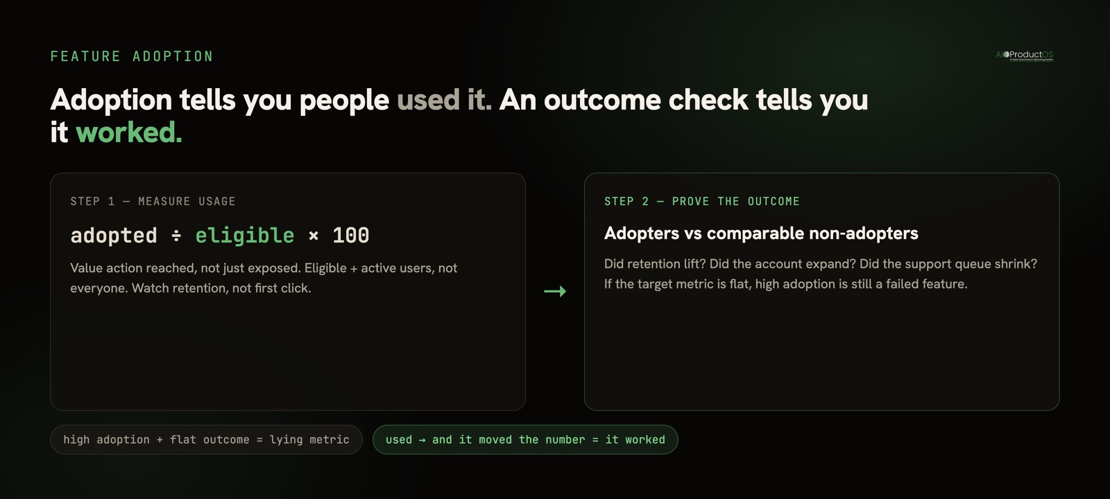
That last sentence is the whole reason this guide exists. Most adoption write-ups stop at the formula. The formula is the easy part. The hard part is choosing an honest denominator, a threshold that means something, and then closing the loop to an outcome so you can tell a used feature apart from a working one.
Get the denominator right (this is where the number gets gamed)
The numerator is rarely the problem. The denominator is where adoption rates quietly lie.
"Total product users" sounds precise, but it hides three choices that swing the result by double digits:
- Eligible, not everyone. If a feature only appears for admins, or only on paid plans, or only after a project exists, your denominator is that eligible group - not every account you have. Divide by all users and you will understate adoption and chase a number that can never reach a healthy level.
- Active, not registered. Dormant accounts that never log in will never adopt anything. Measuring against registered users instead of active ones drags every adoption rate toward zero and makes features look worse than they are.
- Post-launch, not all-time. A feature shipped last month should be measured against users who had a chance to see it since launch, not against people who churned a year before it existed.
None of these are cheating on their own. Cheating is picking whichever denominator makes the slide look best and not saying which one you used. Write the denominator down next to the number, every time.
Pick a threshold that means "adopted," not "touched"
The second decision is what counts as adoption. A user who clicked into a feature once and bounced is not the same as a user who made it part of their routine. Two thresholds are worth separating:
- Activation: the first time a user reaches the feature's core value action - not the button, the payoff. For an export feature, it is a completed export, not opening the export menu.
- Repeat / sticky use: the user came back and used it again inside a defined window. This separates one-time curiosity from a feature people actually rely on.
A single "adopted yes/no" flag collapses these into one and flatters your numbers. If you can only track one thing, track the value action. If you can track two, track the value action and whether it recurs.
The core feature adoption metrics
Adoption rate is one metric in a small family. Each answers a different question, and each has a specific way to be misread. Use them together - no single row is the whole picture.
| Metric | What it answers | How to measure it | Trap to avoid |
|---|---|---|---|
| Adoption rate | What share of eligible users use the feature? | (adopted users / eligible users) × 100 | Inflating the denominator with ineligible or dormant users |
| Breadth of adoption | How widely has it spread across accounts, not just users? | Share of accounts with at least one adopter | High per-user breadth hiding that only one account drives it |
| Time to adopt | How fast do users reach the value action? | Median days from exposure to first value action | Averages skewed by a few outliers; use the median |
| Feature retention | Do adopters keep using it? | Share of adopters still active N days later | Counting first use as success while retention quietly decays |
| Depth of adoption | How fully do they use it? | Actions per active user, or advanced-capability use | Rewarding volume when the goal was a single clean outcome |
If you build only one of these, build feature retention alongside adoption rate. A feature people try once and abandon can post a respectable adoption rate for a full quarter while delivering nothing.
When a high adoption rate is lying to you
Here is the section the vendor glossaries skip. A high adoption number is not automatically good news, and a low one is not automatically bad. Before you celebrate a metric, run it past these cases.
Features you want low usage on. An error state, an undo action, a refund flow, a "contact support" button - rising usage here is a symptom, not a win. If adoption of your error-recovery screen climbs, something upstream is breaking more often. Measuring these the same way you measure a headline feature will lead you to optimize for exactly the wrong direction.
Power-user and admin features with a small legitimate audience. A bulk-permissions editor or an API-key manager is meant for a handful of people per account. Ten percent adoption might be its ceiling and completely healthy. Holding it to the same bar as your primary workflow will get a perfectly good feature killed.
Forced adoption that inflates the number without value. Put a full-screen modal in front of every user and adoption of whatever it points at will spike. That is compliance, not adoption. The number goes up; the value does not. If a nag, an interstitial, or a forced default is doing the lifting, the metric is measuring your interruption, not the feature's pull. Watch what happens to usage after you remove the prompt - that is the real adoption.
Adoption with no outcome behind it. This is the big one. A feature can be widely adopted, sticky, and used deeply, and still be a failure - because the thing it was built to move did not move. High adoption of a feature meant to reduce churn means nothing if churn is flat. Usage is the input. The outcome is the point.
Prove it worked: tie adoption to an outcome
Every feature is built with a hypothesis: if people adopt this, some outcome improves. Retention lifts. Accounts expand. A support category shrinks. A job gets done faster. Measuring adoption without checking that outcome is measuring effort, not results.
The honest test has two steps. First, measure adoption correctly using the metrics above. Second, compare the outcome you were targeting between users who adopted and comparable users who did not - same cohort window, same segment - so you can see whether adoption actually tracks the result, rather than just co-occurring with it. If adopters retain no better than non-adopters, the feature has not earned its place, however strong the adoption rate looks.
Doing this cleanly is mostly a data-plumbing problem. Feature usage usually lives in your analytics tool, revenue lives in billing, and retention lives somewhere else again - so joining "did they adopt" to "did the outcome move" means stitching three systems together by hand for every feature. It is doable in any product-analytics stack - our comparison of the best product analytics tools walks through which ones support cohort-to-outcome joins, and how to choose product analytics tools covers the trade-offs - and it is worth the effort even when it is manual. The method matters more than the tooling.
Because that join is the recurring tax, it is also worth designing away. In AIOProductOS, feature usage sits on the same customer record as revenue and feedback, so adoption is already tied to the account and its outcome - every shipped feature carries a verdict on its task card showing adoption, MRR adopted, and retention lift, without re-stitching the data each time. That is the closed loop the outcomes view is built around: not "did people use it," but "did it work." If churn is the outcome you are chasing, our churn-rate calculator is a quick way to set the baseline you will measure adopters against.
Measure adoption to know people found the feature. Measure the outcome to know it deserved to ship. Skip the second step and a green adoption chart will keep telling you a feature succeeded long after it stopped mattering.
Ready to stop guessing which features earned their place? See how the outcome loop ties feature adoption to the revenue and retention it was built to move - on one record, without the manual join.