Three of our MCP tools render as an interactive view inside the conversation. The rest do not, and getting to that ratio was the actual design work.
Most well-ranked pages on this topic treat an MCP App as strictly better than a text answer. Here is the extension, here is a chart appearing inline, ship one. What they skip are the two decisions that only show up after you have shipped. The first is which tool earns a UI, because some tools are genuinely worse as an app than as a paragraph. The second is what your app does on a host that cannot render it at all, which is most hosts, most of the time.
What are MCP Apps?
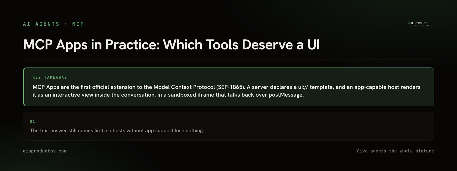
MCP Apps are the first official extension to the Model Context Protocol. A server declares a ui:// template alongside its tools, and an app-capable host renders that template as an interactive view inside the conversation instead of printing text. The view runs in a sandboxed iframe and talks to the host over postMessage.
That also answers the question people ask immediately after: an MCP server and an MCP App are not alternatives. The server is the program that exposes tools. An app is an optional presentation layer one of those tools may attach to its result. Same server, same call, different rendering. If the protocol layer itself is new to you, start with what MCP actually is, and how to build an MCP server for the layer underneath.
Which tool deserves a UI
We shipped three apps across a 71-tool surface, and the filter turned out to be three questions. Is the answer a shape rather than a sentence? Is the reader's next move to change something? Is there more than one item in play? A tool that fails all three is a paragraph wearing a frame.
Here is how that landed on our own surface.
| Tool | Surface | Why |
|---|---|---|
list_tasks | ui:// live board | Many items, spatial by nature, and the next move is to change a status. The app writes back through update_task |
get_weekly_signal_memo | ui:// memo | A list of themes where the useful action is picking one and turning it into a linked task |
analyze_funnel | ui:// revenue-weighted funnel | Proportion is the whole answer. A handful of numbers in prose hides the drop that a rendered funnel shows at a glance |
get_task | Text only | One record. A sentence is faster to read than a card, and it stays in the transcript |
create_task | Text only | A single write with one confirmation. A form would add a step to a one-step action |
get_product_brain | Text only | The consumer is the model, not a human. Rendering it for a person nobody asked about is wasted surface |
The pattern in the bottom half of that table is the one rarely stated anywhere. Tools whose reader is the model, tools that return exactly one record, and tools that already complete in a single step all get worse when you wrap them in a view. This is the same reasoning as choosing what a tool returns in the first place, which is why the tool surface, not the app surface, is where a spine MCP earns its keep.
The host that cannot render your app is the normal case
ChatGPT, Claude, Goose, and VS Code have shipped support for the extension. That is a genuine list, and it is still a minority of the clients that will call your server this week. Anything running headless, anything in CI, and anything built before the extension existed will ignore your ui:// template without comment.
So the load-bearing design constraint is ordering. Build the text return first and ship it. Attach the template afterwards, as an enhancement to a result that was already complete. Our three apps are progressive enhancement by construction: the text answer always comes first, so a client without app support loses nothing.
The failure mode is small and easy to commit. A tool returns See the panel above. and nothing else. On a text-only host that is a dead end. On an app-capable host it is still a dead end, because the model does not see your rendered iframe either. The human does. The model reads the text return, and it is the model that has to reason about what happened next, summarize it, or chain another call off it. Your text return is doing double duty even when the app renders perfectly.
What the sandbox buys, and what it costs
The extension does not leave isolation to each host to invent. App UI runs in a sandboxed iframe with no access to the host's DOM, cookies, or storage, and it communicates only over postMessage. It cannot read the surrounding conversation or the user's session.
Servers also pre-declare the domains their templates will contact, which lets a host prefetch and security-review a template before rendering anything, and connections to domains that were not declared are refused. That is a real security property and also a real constraint on your build: the font CDN and the chart library you like either get declared up front or get inlined. Plan for it before you write the template, not after a host silently blocks the request.
When a text answer beats an app
This is the section that decided our ratio, so it is worth making the strongest version of the case.
Text is the record. A conversation transcript is greppable, quotable, diffable, and it survives export. An iframe does not appear when someone copies the conversation into a ticket, and it does not appear in the model's own account of what it did. Every answer you move exclusively into a rendered view is an answer that leaves no trace anywhere downstream.
Text is what unattended runs consume. An agent working through a queue overnight has no human eye pointed at it. For that caller, every app you built is dead weight and every text return is the entire product. Ours run against the same surface a person uses, which is exactly why the text layer cannot be the afterthought.
An app is a second surface with its own maintenance. Template versioning, a declared CSP domain list, a render check every time a host updates, and a design review when your own data model shifts. Three apps is a number a small team keeps correct. Thirty is a frontend project that will drift out of sync with the tools underneath it, and a stale app is worse than no app because it looks authoritative.
The host already handles text well. Keyboard navigation, screen readers, font size, theme, and text selection all work in the host's own rendering because the host owns them. In your iframe you own them, and you probably have not done that work.
Now the concession, because it is the honest half. When the answer genuinely is a shape, text cannot substitute. Nobody reads a column of funnel percentages and sees the drop. Nobody reads twenty task titles and sees the column that is jammed. And when the next action is flipping a status on one of many things, a click beats dictating the item back to the model in prose. For those three cases the app is not decoration, it is the answer, and that is precisely why we shipped exactly those three.
Check it against a real workspace
You can verify the text layer without an account. Run:
npx -y @aioproductoscom/mcp@latestWith no PRODUCTOS_TOKEN set, the stdio server starts in demo mode against a fully seeded showcase workspace called Brightline, exposing a read-only subset of the tools. Nothing to paste, nothing to cancel. Call list_tasks and you get typed task records with status and assignee fields, not a prose summary. Call analyze_funnel and you get the stage figures the funnel app renders from. That is the layer every app sits on top of, which is the point: demo mode is read-only, so what you are checking is the substrate, and the write-back path through update_task needs a real token.
The hosted endpoint is where the three ui:// apps are served, over Streamable HTTP with OAuth 2.1, alongside the full tool surface. The full tool and app surface is documented tool by tool, and the machine-readable version is at https://aioproductos.com/.well-known/mcp.json.
If you are deciding what to expose to an AI client rather than what to render for a person, the tool surface is the decision that matters and the app is the smaller follow-on. See what the spine MCP exposes, then pick your three.