Can you do product analytics without a data team?
Yes - and tooling stopped being the obstacle a while ago. Self-serve analytics already lets a product manager build a funnel, a cohort, or a retention curve without writing a line of SQL. What the data person actually supplied was judgment: which question to ask, what the denominator is, and when a number is quietly lying. That part does not ship in the box.
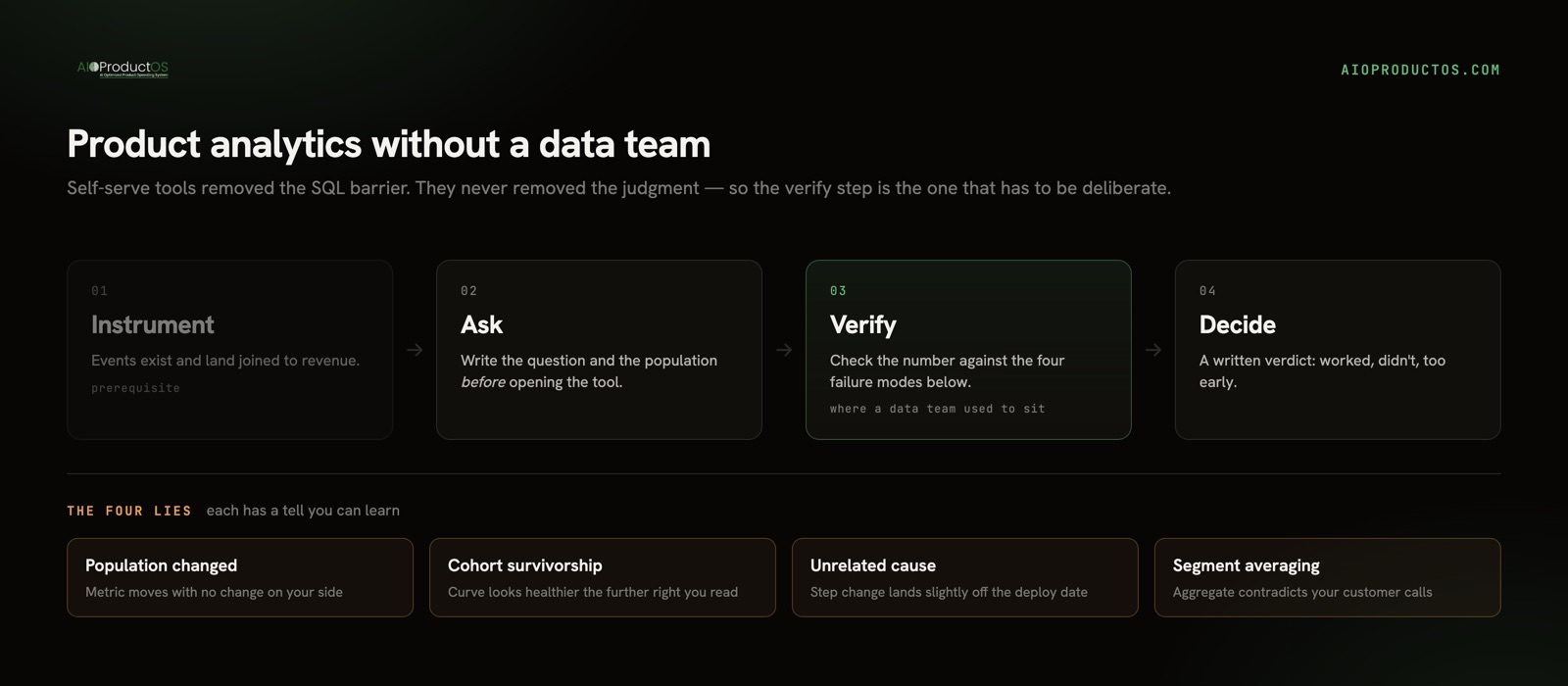
Almost every guide to this question answers a different one - "which tool lets a non-technical person query data" - and then stops, as if access were the whole problem. Access was the problem a decade ago. Today the failure mode is a PM with full query access confidently reading a chart wrong. So this is not a tool roundup. It is the routine to run and the specific ways self-serve analysis goes wrong when nobody is standing behind you.
One prerequisite before any of this applies: events have to exist. Getting the SDK in and the track calls firing is its own job, covered in product event tracking without a data team. Everything below starts the day after that.
What the data person was actually for
Ask a PM who lost their analyst what they miss, and they rarely say "running queries." They say some version of: nobody tells me when I'm wrong anymore.
A good analyst does four things a dashboard cannot. They convert a vague product question into one that has a definite answer. They pin down the population - who is in the number and who is excluded. They notice when a metric moved for a reason unrelated to anything you did. And they say "that's not what this chart shows" out loud, at the moment it matters, before a roadmap decision gets made on top of it.
None of that requires a headcount. All of it requires a habit, and a place where the numbers you need are actually next to each other. That second part is why so many teams fail at this even with excellent tools: the average company now runs 101 SaaS apps and wastes about $21M a year on licenses nobody uses (Okta + Zylo). Usage sits in one, revenue in another, feedback in a third - so half your analysis time goes to reassembling context instead of interrogating it.
The routine: four questions, on a fixed cadence
Ad-hoc analysis is where judgment fails, because you only look when something already looks interesting - which is a filter designed to find noise. Run a fixed loop instead. It takes twenty to thirty minutes weekly, plus one pass per release.
- Did last week's new accounts activate at the same rate as the week before? Write the cohort window next to the number. Done when you have a number, its population, and a yes/no - not a chart you scrolled past.
- What moved that we did not move? Scan your handful of headline metrics for anything outside its usual range. Done when every movement has either a named cause or an explicit "unexplained" note. Unexplained is a legitimate answer; unexamined is not.
- For the thing we shipped last release: did the accounts it was built for use it, and did the outcome we named beforehand move? Done when there is a written verdict - worked, didn't, too early. The adoption side of this has real traps in the denominator; how to measure feature adoption covers them properly.
- Which paying accounts changed behaviour? Not a percentage - names. Done when you have a short list you could actually email.
Two rules make the loop honest. Write the question before you open the tool, because a query written after you see the chart is a rationalization. And name in advance the result that would change your mind - if no result would, you are not analyzing, you are collecting reassurance. Which four metrics belong in step 2 is its own decision, worked through in product metrics that matter.
The four ways self-serve analysis lies to you
Every one of these is a mistake an analyst would have caught in passing. Each has a tell you can learn.
The population changed, not the behaviour. A conversion rate improves and nobody shipped anything, because a campaign started sending better-qualified traffic, or a pricing change filtered who reaches the funnel at all. You measured the mix, not the product. The tell is a metric that moves with no corresponding change on your side. The fix is to hold the population definition fixed across the comparison and write it beside the number every single time.
Survivorship inside cohorts. Retention curves flatter you at the tail, because the people still present in week twelve are the ones who were always going to stay. Reading "week-12 retention is climbing" as improvement is reading the selection effect. The tell is a curve that gets healthier the further right you look. The fix is to anchor every cohort to its size at entry and compare cohorts against each other, never a single cohort against its own later self.
The number moved for a reason unrelated to your change. Seasonality, an enterprise account finishing onboarding, an outage, a press mention, a competitor's price rise. Post-hoc, any of these will happily accept credit for your release. The tell is a step change that lands slightly off your deploy date, or a move that also shows up in a metric your change could not possibly touch. The fix is a comparison group - users who did not get the change, or an untouched metric as a control. If neither exists, say "we cannot attribute this" and mean it.
Averaging across segments that behave differently. The classic reversal: the aggregate goes one way while every segment inside it goes the other, because the segment mix shifted. Say a feature sits at 30% adoption overall (a hypothetical) and rises to 35% - while adoption among both enterprise and self-serve accounts actually fell, and you simply signed more of the higher-adopting segment. The tell is an aggregate that contradicts what you are hearing from customers. The fix is to split by your two or three genuinely different segments before reading the total, not after someone challenges it.
| Failure mode | The tell | The fix |
|---|---|---|
| Population changed, not behaviour | Metric moves with no change on your side | Freeze the population definition; write it next to the number |
| Survivorship in cohorts | Curve looks healthier the further right you read | Anchor to cohort size at entry; compare cohorts, not a cohort to itself |
| Unrelated cause | Step change slightly off the deploy date | Use an unexposed comparison group or an untouched control metric |
| Segment averaging | Aggregate contradicts customer conversations | Split by segment before reading the total |
A fifth, quieter failure sits under all four: the answer depends on data you had to stitch together by hand. Context-switching costs an estimated $450B a year, with the average employee losing about 40% of productive time to it (Gallup/TheTab), and reconciling usage against revenue across three tools is exactly that tax. When usage, revenue, and feedback already sit on one customer record - as they do in the analytics module - the population is defined once instead of re-derived per question, and revenue-weighted funnels and retention stop being a manual join. Revenue, demand, and work questions there are computed deterministically rather than generated, which removes one more place a number can be wrong without saying so.
When you genuinely do need an analyst
Not as a hedge - there are real lines, and this routine does not cross them.
Hire when experimentation goes past a handful of concurrent tests and you need proper power calculations and someone with the standing to stop you calling a winner on day three. Hire when three squads report "activation" and produce three different numbers, because that is a governed metric-definition problem, not a dashboard problem. Hire when revenue reporting has to reconcile to the books, when you need modeling rather than measurement - churn propensity, LTV, forecasting - or when the questions require blending ads, CRM, support, and finance into something a product tool was never meant to hold.
Two practical tripwires: when analysis is eating more than a third of someone's week, and when the cost of one confidently wrong answer exceeds the cost of the hire. Below those lines, an analyst mostly enforces a discipline you can hold yourself. Above them, you are asking for infrastructure, and no amount of self-serve rigour substitutes.
The short version
Product analytics without a data team is not a tooling gap anymore; it is a judgment gap. Close it with a fixed weekly loop, a written question and population before every query, and a standing check against the four lies - shifting populations, survivorship, unrelated causes, and segment averaging. If a feature still looks unused after all that, the diagnosis in why is nobody using my feature is the next place to look.
See usage, revenue, and shipped work on one customer record in the live no-signup demo - no account, no setup.