Why are customers churning?
Customers churn for reasons that are usually already recorded somewhere in your own data - you just can't see them in one place. The reliable way to find out is not to ask the leavers, most of whom won't answer, but to reconstruct each cancellation from billing, product usage, and support history.
That is a different job from measuring churn. Measuring is arithmetic - you can get your rate, retention, and implied customer lifetime out of our churn rate calculator in about a minute. Explaining is investigative work, and most guides on this topic skip straight past the two things that make it hard.
The survivorship trap in your exit survey
Almost every churn guide treats the cancellation survey as the source of truth for "why." It isn't, for a structural reason: the customers who fill it in are not a random sample of the ones who left.
Think about who actually types a reason into that box: people annoyed enough to want you to know, people who liked you and feel a bit guilty, and people whose reason is short and safe to say - "too expensive," "we're using something else now."
Who doesn't answer? The account that quietly stopped logging in four months ago and let the renewal lapse. The team where your champion left and nobody else knew what the tool was for. The customer who never got past setup and was faintly embarrassed about it. Those are often the largest and most fixable segments of your churn, and they are exactly the ones your survey cannot see.
So "price" wins the survey by default. It is the easiest answer to give and the hardest to argue with, and it sends teams into discount spirals to fix a problem that was really onboarding. If your exit survey says price and your usage data says the account never reached its second week of activity, believe the usage data.
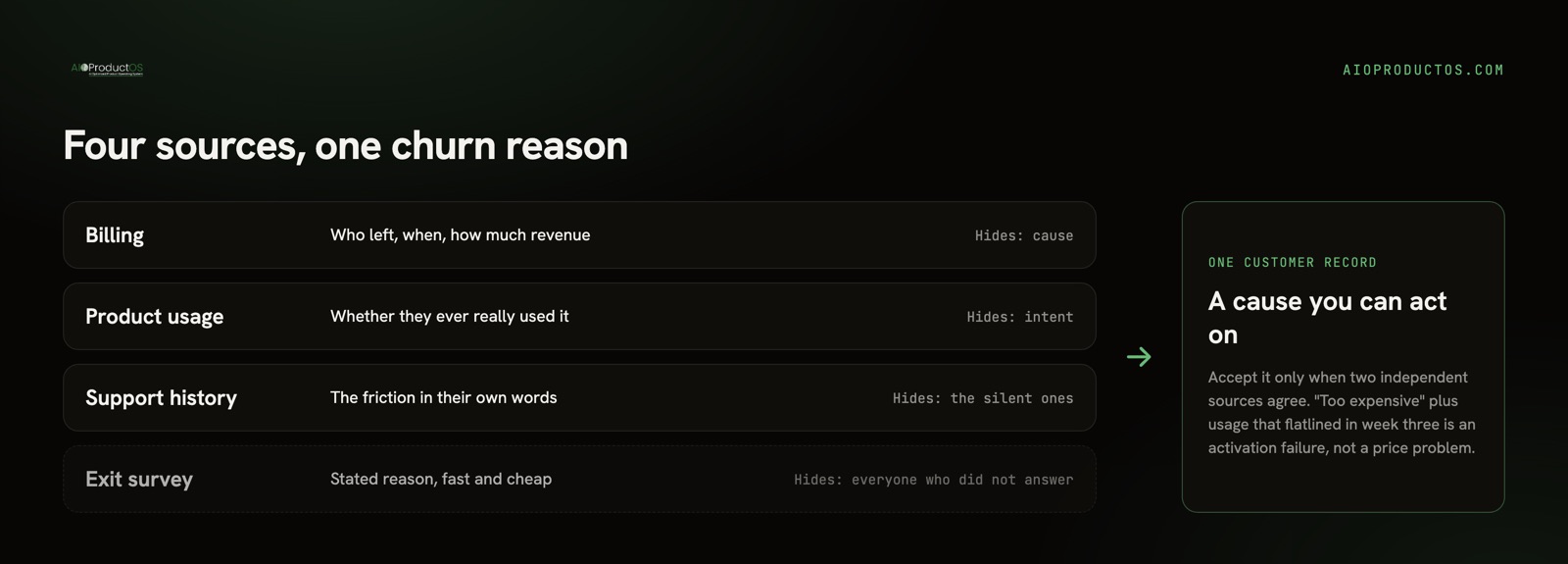
The fix is not to abandon the survey. It's to demote it to one source among four, and to weight it lowest.
The four evidence sources, and what each one hides
Each source tells you something real and conceals something else. Read them together and the blind spots mostly cancel out.
| Evidence source | What it tells you | What it hides |
|---|---|---|
| Billing / subscription records | Who left, when, on what plan, and how much revenue went with them. The only complete list - every churned account appears here. | Nothing about cause. A cancellation reason field, if you have one, inherits the survey's bias. |
| Product usage | Whether the account was actually using the product, which features, how many seats, and when the decline started. Catches silent churn. | Intent. Falling usage tells you they disengaged, not whether it was a missing feature, a champion leaving, or a budget cut. |
| Support and conversation history | The friction in their own words - the bug they hit three times, the question nobody answered, the integration that broke. | The customers who never contacted you. Silence reads as satisfaction and often isn't. |
| Exit survey and cancel-flow answers | Stated reasons, fast and cheap, in the customer's language. | The quiet leavers entirely, plus a bias toward whatever reason is easiest to type. |
The join problem nobody says out loud
Here is the second thing page-one guides gloss over. They all tell you to "segment by cohort and correlate churn with usage" as if that were a single query.
It isn't. In most 5-50-person companies the cancellation lives in Stripe, the usage signal lives in a product analytics tool, the support history lives in a helpdesk, and the interview notes live in a doc somebody wrote in March. Correlating them means four exports, a manual join on email or account ID, and an afternoon of reconciling the rows that don't match because one system keys on user and another on workspace.
That is why small teams talk about churn analysis constantly and almost never actually run one. The procedure isn't intellectually hard; the plumbing is tedious enough that it loses to whatever is on fire this week. Context-switching costs an estimated $450B a year, and the average employee loses about 40% of productive time to it (Gallup/TheTab) - and reconciling four exports that were never meant to be joined is a pure, self-inflicted instance of that tax.
Name it before you start, because it determines your plan. Either you accept one tedious week of manual joining, or you fix the plumbing so the join is already done next quarter - which means billing, usage, and support history landing on one customer record instead of four exports.
The one-week procedure
This is scoped for a team with no data engineer and no dedicated analyst. One product person can run it.
Day 1 - build the list. Export every account that cancelled or lapsed in the last two or three quarters. You want enough rows that a pattern can be real; if two quarters gives you fewer than about 20, widen the window. For each row: cancel date, plan, MRR, signup date, and the stated reason if one exists. Sort by MRR, not alphabetically - this list is about money, not logos.
Day 2 - pull usage for a 60-day pre-cancellation window. For each churned account, get three numbers for the two months before the cancel date: last active date, weekly active seats, and count of your one core action (whatever "using the product properly" means for you). Then pull the same three numbers for a control group of similar-sized accounts that renewed. Without the control group you will find patterns everywhere, because most usage data looks alarming in isolation.
Day 3 - read the support history. Open every ticket, chat, and email thread from each churned account's last quarter. Read them; don't count them. You are looking for the repeated sentence, the unanswered question, the "is there a way to..." that came back three times. This is the single highest-signal hour of the week and the step teams most often skip because it doesn't produce a chart.
Day 4 - code the reasons, and demand two sources. Assign each account one primary cause. Accept a cause only when two independent sources agree. Stated "too expensive" plus healthy usage right up to the cancel date is a genuine value-perception problem. Stated "too expensive" plus usage that flatlined in week three is an activation failure wearing a price costume. Usage falling off a cliff on a specific date with no support contact usually means a person left, not a product failure - check whether your champion's email started bouncing.
The patterns you are looking for map cleanly onto fixes. Never activated (usage never crossed your aha threshold) points at onboarding, not features - the same diagnosis path as working out why nobody is using a feature you shipped. Activated then decayed over months points at a value that faded - a use case you solved once, or a competitor that showed up. Healthy usage, sudden stop points at a person or a budget, not the product. Heavy usage plus heavy support volume points at a product that works but costs too much to operate.
Day 5 - call five of them. Pick five churned accounts, weighted toward the biggest and the quietest, and ask for fifteen minutes. Say plainly you are not trying to win them back. Ex-customers answer more often than people expect, precisely because there is nothing to sell. Use the calls to test the reading you already formed, not to generate it - you now know what their usage looked like, so you can ask "you stopped logging in around the second week of May, what happened then?" instead of the useless open "so why did you leave?"
By Friday you should have one sentence per churned account and a ranked list of causes weighted by the revenue behind them. Then fix the top one. Feeding that back into the roadmap is its own discipline - we covered it in turning customer feedback into product changes.
When churn analysis is a waste of your week
Three cases where the honest move is to skip it.
You have too few churned accounts for any pattern to be real. If six customers left last quarter, there is no analysis to run - there is a spreadsheet with six rows and a phone. Call all six. Any "pattern" you extract from n=6 is a story you told yourself, and you will spend a quarter building against it.
The churn is a pricing or ICP decision you already made. If you raised prices, dropped a plan, or deliberately moved upmarket, the resulting churn is the cost of a decision, not a mystery. Confirm the leavers are the segment you meant to lose, then stop. Investigating churn you chose is a way of relitigating a decision without admitting that's what you're doing.
You already know the answer and haven't fixed it. Plenty of teams run a fourth churn analysis to avoid shipping the fix the first three identified. If your last review said onboarding and onboarding is unchanged, the bottleneck is not evidence.
One thing to avoid in all three cases: reaching for an industry benchmark to tell you whether your churn is "normal." Published churn benchmarks vary so widely by segment, contract length, and price point that they can justify almost any number you already have. Compute your own baseline, split it by cohort and by revenue rather than by logo count, and trend it - your churn six months ago is the only comparison that means anything.
Make the join permanent
The reason this is a week of work rather than a query is that the evidence lives in four systems that don't share a customer record. If you run this analysis twice and it hurts both times, that is your signal to fix the structure rather than repeat the exercise.
This is the join AIOProductOS is built around: one record per customer that carries revenue, feedback, support conversations, and product usage together, with feedback from reviews, requests, surveys, and support arriving on one feed linked to the accounts and features behind it. When the cancellation, the usage curve, and the support thread are already on the same page, "why did this account leave" stops being a project and becomes a question you can ask on a Tuesday. If you're choosing what to measure alongside churn, our field guide to product metrics that matter covers the rest of the short list, and the churn rate calculator will give you the baseline to trend.
See how Insights puts the feedback, the account, and the revenue at stake on one record.