How do you know if a feature improved retention?
You know a feature improved retention when the accounts that got it keep paying at a higher rate than comparable accounts that did not, over a window you fixed before launch, with the gap weighted by the revenue at stake. "Adopters retain better than non-adopters" is not that answer. Most of the time it is a description of your best customers.
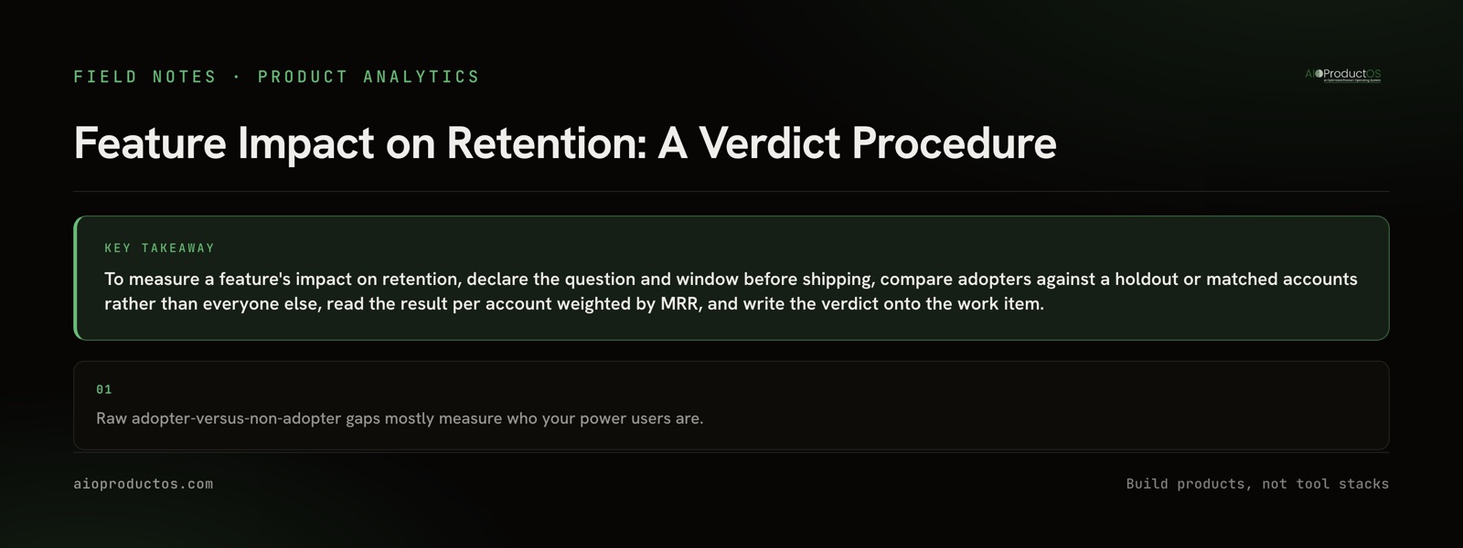
Most guides on this topic chart the retention of users who touched a feature, then stop before the part that decides whether you can trust the number: who you compare against, at what level, over what window, and where the answer ends up. This post is a procedure for that part.
Feature retention is not product retention
Two different things get called "retention" in the same meeting.
Feature retention is whether people who used a feature keep using it. It belongs in your adoption measurement, and our guide to measuring feature adoption covers it alongside adoption rate, breadth and depth.
Product retention is whether the customer keeps paying. In B2B that means the account renews, stays on its plan, or expands.
A dashboard one analyst opens every Monday is sticky, and may change nobody's renewal decision. When a stakeholder asks "did this feature help retention?", they mean product retention, and answering with feature retention is how roadmaps fill up with features that are used but don't matter.
If the honest first answer is that almost nobody adopted the feature, stop here and work through why nobody is using the feature first. You cannot measure the impact of something that never reached the accounts.
The trap: power users adopt everything
Here is the problem most write-ups skip. The accounts that adopt your new feature are not a random sample. They are disproportionately the accounts that log in most, have the most seats, have a champion who reads your changelog, and were already the least likely to leave.
So when you compare adopters against everyone else, you find a retention gap almost every time, for almost every feature. The gap is real. The feature didn't cause it. You are measuring engagement and calling it impact.
It also runs the other way: an account that has already decided to leave stops exploring and adopts nothing you ship, which makes non-adopters look worse and widens the gap further.
A cheap way to check your method is a placebo test. Run the same comparison on a feature you're confident has no bearing on retention, such as a settings page tweak or a new color theme. If that feature also "drives retention", your comparison is measuring who your engaged customers are, not what your features do.
Pick the comparison before you ship
The fix is to choose a comparison that controls for who adopts. There are four common options, and they are not equally good.
| Method | What it controls for | What it misses | When to use it |
|---|---|---|---|
| Holdout or A/B test (feature withheld from a random set of accounts) | Selection bias, seasonality, pricing changes and other releases, because both groups live through them | Needs enough accounts and a willingness to withhold the feature; randomizing by account in B2B shrinks your sample fast | The feature sits behind a per-account flag and you have the volume |
| Matched cohorts (each adopter paired with a similar non-adopter) | Plan, MRR band, tenure, seat count and pre-launch activity level | Anything you didn't match on, like a champion leaving or a budget freeze | No holdout, but you have usage history from before the launch |
| Before and after on the same accounts | Stable traits of each account | Seasonality, price changes and anything else that shipped in the window | The feature went to everyone at once and your base is small |
| Raw adopters vs non-adopters | Nothing | Selection bias, completely | A smoke test only, never a verdict |
The order is the recommendation. Use the highest method you can actually run. If you end up on the last row, say so next to the result.
Declare the verdict question and window up front
Write the question on the work item before the feature ships. Once you've seen the data, redefining retention, moving the window or narrowing the segment until the answer looks good are all easy to justify, which is why they have to be fixed first.
The declaration needs five things:
- The retention definition. Logo retained, MRR retained, or renewed at the next contract date. Pick one as primary.
- The eligible population. The accounts that could actually use the feature, not your whole customer list.
- The adoption threshold. What counts as an account adopting it. A good default is reaching the value action, with at least one repeat.
- The comparison method, from the table above.
- The window, measured from when each account adopted, not from launch day.
Tie the window to how customers decide to leave. On monthly plans, wait until the comparison groups have been through a few renewal cycles. On annual contracts a quarter tells you almost nothing about retention, so track a leading indicator such as seat growth or usage depth, label it as a proxy, and come back at renewal. Also write down in advance what result would count as "no effect". Without that line, every small positive gap reads like a win.
Read it at the account level, weighted by MRR
In B2B, users don't churn. Accounts do. Two things follow from that.
First, count adoption per account. Ten active users inside one account are one adopting account, and that account renews or leaves as a unit.
Second, weight by revenue. Report retained MRR next to logo retention for both groups. When the two disagree, that's worth knowing: a feature can be kept by small accounts and ignored by the ones paying most, or the other way round.
This needs billing data sitting next to usage data, keyed on the same account. If those live in different systems today, connecting Stripe to product analytics walks through the join.
How can we track which features actually drive retention?
Doing this once is manageable. Doing it for every feature is where teams give up, and the reason is plumbing, not statistics. You need three records joined on the same account: usage events in the analytics tool, accounts and MRR in billing or the CRM, and the shipped work item with its declared question in the tracker. Without a shared key, every verdict is an export-and-reconcile project, so teams measure only the launch they're proud of, which is its own selection bias.
Tracking which features drive retention means making the verdict routine: every shipped item gets one, including the ones that look bad, stored where the next prioritization decision gets made.
That is the loop the outcomes view is built around. In AIOProductOS, usage from product analytics, the account, and its revenue sit on one spine, and every shipped feature carries a verdict (adoption, MRR adopted, retention lift) on its task card. The lift is correlational, with the same selection caveat this whole post is about. A declared A/B winner adds its measured lift. Treat the correlational figure as a prompt to dig in, not as proof.
When a verdict says retention didn't move and accounts are still leaving, the next step is a proper churn analysis to find out what is actually driving it.
Hand the comparison to an AI assistant, then verify it yourself
Because the AIOProductOS spine is callable over MCP, you can connect an AI assistant to it (setup is on the MCP page) and ask the question in plain language:
"For the feature shipped in task X, compare 90-day retention and MRR of accounts that adopted it against matched accounts that did not."
A useful answer should include:
- The adoption definition it used and how many accounts are in each group.
- The criteria it matched on, such as plan, MRR band, tenure and pre-launch activity.
- Logo retention and retained MRR for both groups over the same window, measured from adoption.
- A plain statement that the result is correlational unless a holdout was declared.
- A reference back to the task, so the verdict can be recorded against it.
If the answer leaves out the matching criteria, mixes windows, or compares adopters against "everyone else", don't accept it. Ask again, and verify it yourself against the task card before it goes into a planning doc.
When you should not bother measuring retention lift
This procedure has a cost, and sometimes it isn't worth paying.
Too few accounts. If only a handful of accounts are eligible, no comparison method will separate a real effect from noise. Talk to them. A few customer calls will tell you more than a confidence interval wide enough to hold any answer.
Table-stakes features. SSO, audit logs, data export and compliance controls exist to unblock deals or to stop customers leaving because they're missing. Measure them by the deals they unblock, or accept that they're a cost of doing business. A retention-lift number on SSO will mislead you.
You already run experiments properly. If features ship behind flags and you trust your experimentation tool, use it, and just write its result onto the work item.
The decision can't change. If nobody will reprioritize based on the answer, measuring it is theater.
The feature was meant to move something else. If it was built to cut support load or speed up onboarding, measure that instead.
Write the verdict back where the next decision happens
Record the verdict on the work item that shipped the feature: the declared question, method, window, result and confidence. There are three honest outcomes: it moved, it didn't, or you can't tell. "Can't tell" beats a hopeful guess. After a few quarters you have what most roadmaps lack: a record of which work actually kept customers, weighted by what they pay.
Want the verdict on the card by default instead of rebuilt per launch? See how the outcome loop connects each shipped feature to the accounts and revenue it was meant to keep.